Getting Started
Classic
Logging into your Placester Account [Classic]
Requesting an IDX Integration [Classic]
Editing Your Contact Details [Classic]
Changing Themes and Colors [Classic]
Adding Images to your Home Slideshow [Classic]
Adding a Favicon [Classic]
Linking Social Networks [Classic]
Adding Certification Logos to the Footer of your Site [Classic]
Changing your Global filter settings [Classic]
Using Basic Lead Capture [Classic]
Creating a Blog Post [Classic]
Creating Advanced Area Pages and an Area Page Index [Classic]
Creating a Page [Classic]
Adding a Logo [Classic]
Codeless
Getting Started Checklist
Logging into your Placester Codeless Account [Codeless]
Requesting an IDX Integration [Codeless]
Image Dimension Guide [Codeless]
Changing your Global filter settings [Codeless]
Editing Your Codeless Contact Details [Codeless]
Adding Images to your Home Slideshow [Codeless]
Featuring Listings on your Home Page [Codeless]
Adding Certification Logos to the Footer of your Codeless Website [Codeless]
Adding a Favicon [Codeless]
What is Codeless?
Updating Classic to Codeless Website
Non IDX Website
Social Feed ( Codeless )
Notification System in the Admin Panel
How to add JS Code to your Placester Website ( Codeless )
The Codeless Design Library and Design Switching
Ordering a Simple Service or a DIFM Task
What Is Services?
Following a Project in Services
Messaging Your Creative Assistant and Sending Files
Placester's Web App
All Things IDX
Classic
TREC Requirements [Classic]
RightSignature Cheat Sheet
Adding Your License Number to Your Site [Classic]
Adding Multiple IDX feeds to your site [Classic]
Map Search [Classic]
Natural Language Search [Classic]
Selecting Search Forms [Classic]
Featuring Listings on your Home Page [Classic]
Basic Areas and Creating an Areas Index Page [Classic]
How Placester Handles 1/4, 1/2 and 3/4 Baths [Classic]
Codeless
How to fill out your IDX Documents on RightSignature.com
IDX Process: FAQ's
TREC Requirements [Codeless]
MLS Recommendations/ Updates
IDX Manager [Codeless]
Customizer: Requesting an IDX Integration [Codeless]
Adding Multiple IDX feeds to your site [Codeless]
What Is Upgraded Property Search?
IDX Support Fee
How to Enable Upgraded Property Search on Your Website?
IDX Integration Removal
Setting Priority on Listings
Account, Subscription & Billing
Codeless
Updating Account Email
Placester Mobile App
Hiring a Creative Assistant Using On-Demand
Account Reactivation
Plan and Billing: Invoices & Accessing the Usage Trail
Understanding and Updating Your Business Profile
Updating Payment Details
How to Capture Leads
Customizing your Website
Classic
Custom Domain
How and Where to Purchase a Custom Domain
Pointing your Custom Domain to your Placester Site [Classic]
Editing your Placester Subdomain [Classic]
Forwarding Additional Domains to Your Website [Classic]
Mapping Your GoDaddy Domain to Placester (New User Interface) [Classic]
Mapping your Network Solutions domain to Placester [Classic]
Mapping your Register.com domain to Placester [Classic]
Mapping your Wix Domain to Placester [Classic]
Mapping your iPage Domain to Placester [Classic]
Mapping your Domain.com domain to Placester [Classic]
Mapping your Bluehost Domain to Placester [Classic]
Mapping your Name.com Domain to Placester [Classic]
Mapping your HostGator domain to Placester [Classic]
Mapping Your Domain vs. Forwarding With Masking [Classic]
Mapping your .REALTOR Domain to Placester [Classic]
Mapping your eNom domain to Placester [Classic]
Common Domain Mapping Issues & How to Resolve Them [Classic]
Mapping your DreamHost domain to Placester [Classic]
Mapping your Google Domain to Placester [Classic]
Mapping your Hover domain to Placester [Classic]
Mapping your Namecheap domain to Placester [Classic]
Mapping a Subdomain to your Placester Site [Classic]
Pages, Menus & Posts
Using the Featured Listings Page Template [Classic]
Editing an Existing Blog Post [Classic]
Adding Photos to Pages and Posts [Classic]
Editing Your Menu [Classic]
Adding Featured Content Tiles [Classic]
Adding a blog post to a category [Classic]
Scheduling Blog Posts [Classic]
Choosing Testimonial Featured images [Classic]
Page Templates [Classic]
Editing an Existing Page [Classic]
Using Formatting Options on Pages and Posts [Classic]
Adding Videos to Pages and Posts [Classic]
Advanced Page Editing [Classic]
Creating a coming soon page [Classic]
Adding HTML to a Page [Classic]
Adding a Menu Item that links to a Custom URL [Classic]
What to Include in your About page [Classic]
Home Valuation Page [Classic]
Creating a Custom Landing Page [Classic]
Creating a Testimonials Page [Classic]
Theme Guides
Sedona Theme Guide [Classic]
Chicago Image Dimension Guide [Classic]
Franklin Theme Guide [Classic]
Toronto Theme Guide [Classic]
Phoenix Theme Guide [Classic]
Beacon: Image Dimension Guide [Classic]
Wilshire: Image Dimension Guide [Classic]
Plymouth Image Dimensions Guide [Classic]
How Many Featured Listings and Blog Posts Are Displayed on Each Theme's Home Page? [Classic]
Fremont Theme Guide [Classic]
Highland Image Dimensions Guide [Classic]
Newbury: Image Dimension Guide [Classic]
Recommended Logo Sizes for Each Theme
Lexington: Image Dimension Guide [Classic]
Best Practices
What Should My Slideshow Captions and Links Be? [Classic]
What's Important To Feature In Your Menu [Classic]
Adding your Google Analytics Tracking Code [Classic]
Adding your Google AdWords Conversion Label and ID [Classic]
Adding a Video Link to Your Home Slideshow [Classic]
What To Do After Your Site Is Live [Classic]
How and Why to Add Excerpts to Pages [Classic]
Adding a Facebook Pixel to your Placester Site [Classic]
Submitting your Sitemap to Google
Site Verification for Google, Pinterest, and Bing [Classic]
Adding a Meta Description & Meta Title to your Home Page [Classic]
Adding a Meta Title & Meta Description to Pages and Posts [Classic]
Pro Tips
Writing Your First Blog Post [Classic]
How to Embed a Google Calendar onto your Placester Site [Classic]
Selecting Great Slideshow Images and Where to Find Them [Classic]
How To Create a "Join our Team" Page [Classic]
How to Use Social Networks for Real Estate [Classic]
Adding Social Networks ( Classic)
Which Lead Capture Setting is Best For You? [Classic]
How to optimize SEO on your Placester Site
Removing "For Rent" From Your Search Bar [Classic]
Tips and Resources for Cropping and Resizing Images [Classic]
Sharing Blog Posts on Social Media [Classic]
How to Clear Your Cache [Classic]
How Can I Drive Traffic To My Site?
Account
Codeless
Pages, Menu and Posts
Using Featured Listings Page Template [Codeless]
Creating Advanced Area Pages and an Area Page Index [Codeless]
Creating a Testimonials Page [Codeless]
Managing Property Details Page
Integrating Your Real Satisfied Account [Codeless]
Creating new testimonial [Codeless]
Accessibility Widget [Codeless]
Open Houses- Module, Widget and Page Template
Adding a Menu Item that links to a Custom URL [Codeless]
Scheduling Blog Posts [Codeless]
Home Valuation Page [Codeless]
How to create an About Page [Codeless]
Adding Modules to Pages, Areas, Agents, Blog post, Offices and Testimonials
Create and Manage Agent Groups in your Agent Index page
Custom pages for recent sales/open houses (Codeless)
Market Data on Area Pages
Sold Listings
How To Hyperlink Text And Images
Adding a Blog Post to a Category [Codeless]
Advanced Page Editing [Codeless]
Map Search ( Codeless)
Codeless Coming Soon Listing Page [Codeless]
Creating a Custom Landing Page [Codeless]
Choosing Testimonial Featured images [Codeless]
Editing an Existing Blog Post [Codeless]
Adding a Button to a Page [Codeless]
Creating a Contact Page ( Codeless )
Property Landing Page
Editing Your Navigation Bar [Codeless]
Using Formatting Options on Pages and Posts [Codeless]
Adding Your Facebook App ID [Codeless]
Switching Website Design [Codeless]
Adding Featured Content Tiles [Codeless]
Page Templates [Codeless]
Tips and Resources for Cropping and Resizing Images [Codeless]
Custom Domain
How and Where to Purchase a Custom Domains [Codeless]
Common Domain Mapping Issues & How to Resolve Them [Codeless]
Pointing your Custom Domain to your Placester Site [Codeless]
Forwarding Additional Domains to Your Website [Codeless]
Mapping Your Domain vs. Forwarding With Masking [Codeless]
Editing your Placester Subdomain [Codeless]
Nameservers vs DNS Settings
Mapping your HostGator domain to Placester [Codeless]
Mapping your Register.com domain to Placester [Codeless]
Mapping your DreamHost domain to Placester [Codeless]
Mapping your iPage Domain to Placester [Codeless]
Mapping your Domain.com domain to Placester [Codeless]
Mapping your Hover domain to Placester [Codeless]
Mapping your Google Domain to Placester [Codeless]
Mapping your Network Solutions domain to Placester
Mapping your Wix Domain to Placester [Codeless]
Mapping a Subdomain to your Placester Site [Codeless]
Mapping your Name.com Domain to Placester [Codeless]
Mapping your .REALTOR Domain to Placester [Codeless]
Mapping your Namecheap domain to Placester [Codeless]
Mapping your eNom domain to Placester [Codeless]
Mapping your Bluehost Domain to Placester [Codeless]
Mapping your CloudFlare domain to Placester [Codeless]
Font Style and Size
Leveraging Placester's Simple CRM
Classic
Viewing and Editing Leads
Manually Adding a Lead [Classic]
Removing a Lead [Classic]
Editing your Leads individually and through Bulk Actions [Classic]
Viewing Your Leads [Classic]
Lead Management
Exporting Leads [Classic]
Managing Duplicate Leads [Classic]
What Can Site Visitors Do With an Account? [Classic]
CRM: Managing Custom Views [Classic]
Creating Saved Searches for your Leads [Classic]
Routing Leads From Other Sources to Your Placester Account
Importing Leads [Classic]
How to Add Tags to Leads and Contacts [Classic]
Creating Groups
Adding a Note to a Lead [Classic]
Creating / Managing Tasks (In Leads) [Classic]
How Leads Can Create Saved Searches [Classic]
Using Plans
Creating a Custom Signature [Classic]
Editing a Plan Email Template [Classic]
Creating and Managing Your Email Blasts [Classic]
Editing a Plan [Classic]
Adding single or multiple leads to a plan [Classic]
Creating a New Email Template [Classic]
Creating a New Drip Campaign [Classic]
Broker Features
Codeless
Viewing Your Leads [Codeless]
4.0 Editing your Leads individually and through Bulk Actions [Codeless]
Manually Adding a Lead [Codeless]
4.0 Removing a Lead [Codeless]
Importing Leads [Codeless]
Managing Duplicate Leads [Codeless]
Exporting Leads [Codeless]
4.0 Adding a Note to a Lead [Codeless]
How to Add Tags to Leads and Contacts [Codeless]
Creating Saved Searches for your Leads [Codeless]
How Leads Can Create Saved Searches [Codeless]
Editing a Plan [Codeless]
Creating a New Email Template [Codeless]
Adding single or multiple leads to a plan [Codeless]
Autoresponders
Creating and Managing Your Email Blasts [Codeless]
Creating a New Drip Campaign [Codeless]
What Can Site Visitors Do With an Account? [Codeless]
CRM: Managing Custom Views [Codeless]
New Placester CRM
SEO Capabilities
Codeless: Manual assigning of Leads to Agents
Setting up Integrations
Classic
Codeless
Accessing RealSatisfied Account
Linking Social Networks [Codeless]
What is Zapier?
How to Integrate Your Placester Account With Zapier
Integrating Your Local Logic Account
Follow Up Boss - Placester Integration
Integration: Custom API
TotalBrokerage - Placester Integration
Advanced Website Customization
Classic
Lead Text Notifications Using Gmail [Classic]
Embedding A PDF or File To A Page [Classic]
Custom pages for recent sales/open houses [Classic]
Adding a GIF To Your Home Slideshow [Classic]
Tricks for Speeding up a Slow Website [Classic]
Adding Facebook Messenger to your site [Classic]
Adding a Chat Widget to Your Site [Classic]
Adding a Google Maps location to your Contact page [Classic]
Adding a Logo to Your Site's Footer [Classic]
Adding Google Tag Manager [Classic]
Codeless
Search: Autosuggest Results
Placester Live Chat Feature
Embedding A PDF or File To A Page [Codeless]
Adding Google Tag Manager (Codeless)
Site Verification for Google, Pinterest, and Bing [Codeless]
Lead Text Notifications Using Gmail [Codeless]
Adding Animations to Your Design Modules in Codeless
Overlay management
Custom Property Page Banner
How to Resize and Crop Headshots [Codeless]
Custom Banner
Sign In/ Sign Up Forms
Cookie Banner
Advanced Broker Customization
Classic
Creating an Agents Page [Classic]
Creating an Agents Roster Page on Your Office Site [Classic]
How To Order Agents within your Agent Index Page [Classic]
Creating an Office Page using Customizer [Classic]
Codeless
Other Topics
Compliance
Customizer
Customizer: Creating a Blog Post [Codeless]
Adding a Facebook Pixel to your Placester Site (Codeless)
Customizer: Adding your Google Analytics Tracking ID, AdWords Conversion Label and ID [Codeless]
Customizer: Using Custom Lead Capture[Codeless]
Customizer: Adding a Chat Widget to Your Site [Codeless]
Customizer: Editing an Existing Page [Codeless]
Customizer: Mapping your GoDaddy Domain to Placester [Codeless]
Leveraging Video Modules on Your Codeless Website
How to add your Logo to the Header & Footer [Codeless]
Customizer: Adding HTML to a Page [Codeless]
Customizer: Creating a New Page [Codeless]
Customizer: Adding a Meta Description & Meta Title to your Home Page [Codeless]
Defining Modules and Widgets in Codeless
How to Setup Modules, Manage their Options, and Build Module Presets [Codeless]
Customizer: Adding Photos to Pages and Blog Posts [Codeless]
Customizer: Adding Videos to Pages and Posts [Codeless]
Agent Manager (Office Builder)
Site Editor
Embedding HTML, Forms, and Files
Publishing and Discarding Drafts
Creating Area Pages and an Areas Index
Setting Up Redirects and Your 404 Page
Adding Video to Your Site
Organizing Blog Posts with Categories
Adding Compliance Pages and Footer Links
Editing Your Header, Top Bar, Logo and Footer
Editing Content on the Page
Turning On the Cookie Banner and Accessibility Widget
Creating a Property Landing Page
Creating a Lead Capture Popup
Using the Search Box in Site Edit
Customizing Your Search Results Page
Creating a Blog Post
Linking Your Social Networks
Why Isn't My Change Live?
Adding Testimonials and a Testimonials Page
Adding a Custom Banner
Customizing Property Detail Pages
Module Types Reference
Creating a Custom Landing Page
Editing an Existing Page
Showing Your Agents on Your Website
Scheduling a Blog Post
Editing Your Homepage Hero and Slideshow
Setting Up Placester Live Chat
Formatting Text, Links, Images, and Tables
Getting Started with Site Edit
Choosing Which Listings Appear on Your Site
Page and Post SEO
Showing Open Houses, Recent Sales and Coming-Soon Listings
Adding Tracking Codes and Custom Code
Choosing a Page Type
Updating Your Contact and Office Details
Creating a New Page
Uploading, Cropping and Sizing Images
Site Design and Branding
Working with Modules
Editing an Existing Blog Post
Updating Your Site Title, Tagline, and Favicon
Setting Up AI Listing Search
Verifying Your Site with Google, Bing, and Pinterest
Editing Your Navigation Menu
Adjusting Heading Typography
Switching Your Site Design
Adding Animations and Image Overlays to Modules
Setting Shared Modules and Sidebars for Blog Posts, Areas, Agents and Offices
Working with Widgets
Reusing Modules with Saved Presets
Showing Your Offices on Your Website
Managing Your Pages
Creating a Home Valuation Page
Forwarding Leads and Blocking Form Spam
Customizing Sign-In, Sign-Up, and Social Login
New Agent Manager Features
Assigning Leads from your Brokerage site to your Agents using Agent Manager
Removing an Agent from your Office Builder Account
Adding/ Creating New Agent using Agent Manager
Resolving Conflicts
Deactivating an Agent Website using Agent Manager
Assigning/ Unassign & Changing Agent Site Feature using Agent Manager
How to check an Agent Website Status on Agent Manager
Offices Feature using Agent Manager
Office Builder Plan - Features
Bulk Agent Invitation via .CSV
Providing Admin Access for Broker Agent using Agent Manager
Launching Agent Site Feature using Agent Manager
Publish feature for Agents using Agent Manager
Duplicating an Agent Website using Agent Manager
DIFM
Agent Manager Feature - DIY/ DIFM Subscription
Active Agent Pricing -DIY/ DIFM Subscription
Requesting for a DIFM task and getting in touch with your Creative Assistant
IDX Support Fee- DIY/DIFM Subscription
AI Features
Social Automation
What Is Social Automation?
Setting Up Social Automation
Connecting Facebook and Instagram to Social Automation
Choosing Your Social Automation Templates
Previewing Social Automation Templates
Listing Filters: Controlling Which Properties Get Posted
Choosing a Blog Source for Social Automation
Using the Social Calendar
Troubleshooting Social Automation
Content Automation
Using the Content Automation Dashboard
Choosing Content Automation Topics
Choosing a Content Automation Destination
How To Get Started with Content Automation
What is Content Automation?
Setting Your Content Automation Schedule
Troubleshooting Content Automation
Switching Between AI and Point-And-Click Editing
Customizing Your Site with AI Editor
What is AI Editor?
AI Listing Search FAQ
Troubleshooting AI Listing Search
Customizing AI Listing Search
How To Get Started with AI Editor
Overview of AI Listing Search
Admin Access
- All Categories
- Site Editor
- Adjusting Heading Typography
Adjusting Heading Typography
Site Edit gives you detailed control over how headings look across your website. This article uses Heading 1 as an example to show how to adjust spacing, weight, responsive font sizes, and responsive line heights.
Before you begin: Changes under Design → Typography are site-wide. Review several pages and device previews before publishing.
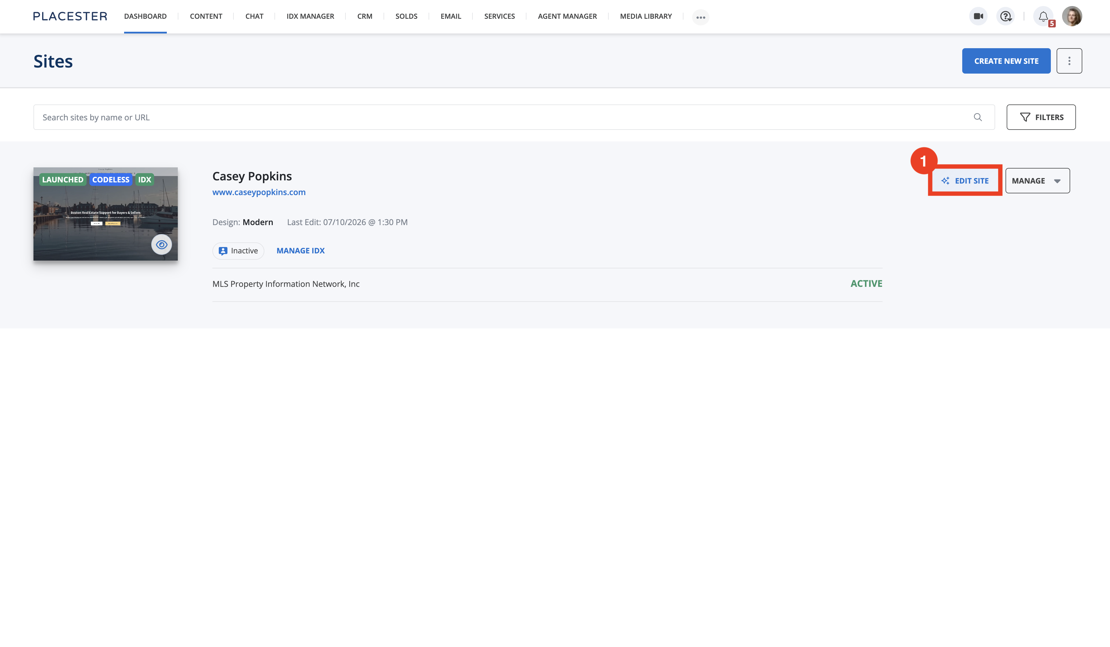
Open Site Edit
- Select Dashboard in the top menu.
- On the site card, select EDIT SITE. Site Edit opens with your homepage.
Open the Heading 1 controls
In the Site Edit toolbar, select Design, then select Typography. Scroll to Heading 1.
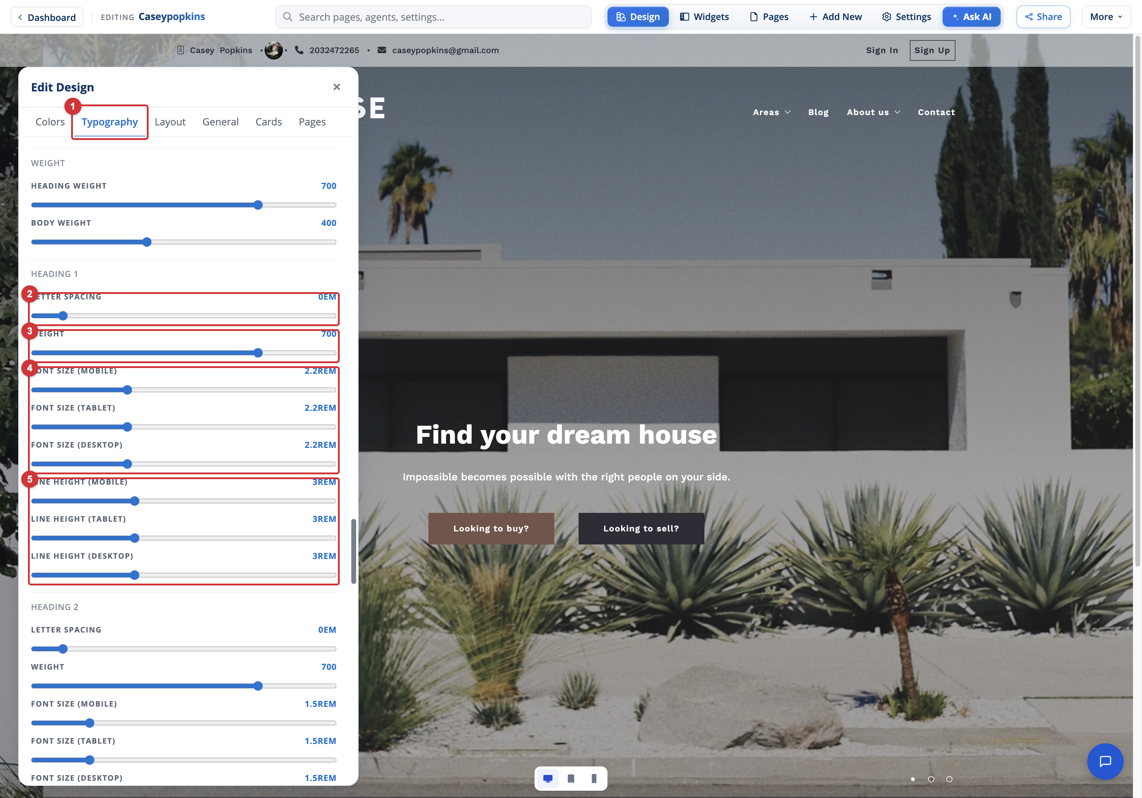
- Typography: Opens the site-wide font and text-style controls.
- Letter spacing: Adjusts the horizontal space between characters.
- Weight: Makes Heading 1 text lighter or heavier.
- Font size: Sets separate Heading 1 sizes for mobile, tablet, and desktop.
- Line height: Sets separate spacing between lines for mobile, tablet, and desktop.
Adjust Heading 1
Move a slider and watch the live site preview update:
- Use Letter spacing to move Heading 1 characters closer together or farther apart.
- Use Weight to change the thickness of Heading 1 text.
- Set Font size (Mobile), Font size (Tablet), and Font size (Desktop) independently.
- Set Line height (Mobile), Line height (Tablet), and Line height (Desktop) independently.
The value displayed beside each control shows the current setting. Font size and line height use responsive values so a heading can remain readable without taking up too much space on smaller screens.
What else you can adjust the same way
Scroll the Typography panel to find the rest of the text styles.
Heading 2 through Heading 6 use the same sliders as Heading 1: letter spacing, weight, and separate mobile, tablet, and desktop font sizes and line heights. Each heading level is independent, so you can set a different size and spacing for each one rather than scaling them all together.
Body Text has the same responsive Font size and Line height sliders, without letter spacing or weight.
Base Size has only the three Font size sliders. It sets the underlying text size your site builds on, so changing it shifts sizes that are measured against it. Adjust it before fine-tuning individual heading levels.
The panel also has controls that work differently from the per-style sliders:
- Styles: A Font size scale with XS, S, M, L, and XL presets that resize site text in one step.
- Font sets: Ready-made combinations that pair fonts for headings, navigation, body text, and buttons. Each option previews its own fonts.
- Weight: Heading weight and Body weight, which apply across the site rather than to a single heading level.
Everything on the Typography tab is site-wide. Per-page font options live under Design → Pages.
Review each device size
Use the desktop, tablet, and mobile preview buttons at the bottom of Site Edit to review the heading at each size.
Check headings that wrap onto more than one line. A font size that works on desktop may be too large on mobile, while a line height that is too small can make wrapped headings difficult to read.
Also review more than one page. Because these controls are site-wide, the Heading 1 style can appear in different layouts and over different backgrounds.
Publish your changes
Typography changes are saved to the Site Edit draft. Select PUBLISH to apply them to the live site, or DISCARD to remove unpublished changes.
For more about applying or removing pending changes, see Publishing and Discarding Drafts.
Need more help?
For questions, concerns, or feedback, chat with our team at app.placester.com/chat.
How did we do?
Editing Your Navigation Menu
Switching Your Site Design

Let experts do it for you
Visit our creative services marketplace to get on-demand help, on-time and on-budget.
Browse all Services
Are you looking for something different?
Didn't find an answer to your questions? Our support team is ready to help you.
